Xenior+
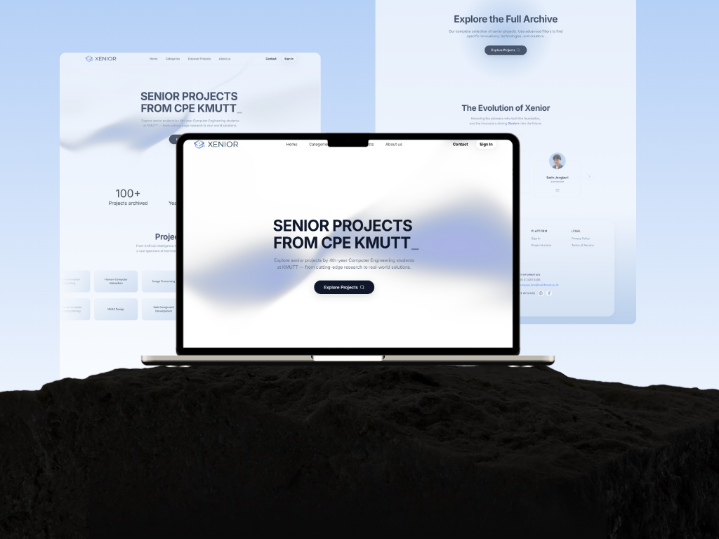
An enhanced redesign of KMUTT’s Xenior system, with new features for project evaluation, search, and progress tracking across three integrated modules.
- Role
- UX/UI Designer & Frontend Developer
- Timeline
- Aug 2025 – May 2026
- Skills
- User Research, Wireframing, Prototyping, Usability Testing
- Tools
- Figma, Procreate, Next.js, Tailwind CSS
Context
Problem Statement
Inefficient project search
The legacy search couldn't filter by specific conditions (advisor, year, keyword), so instructors and students often couldn't retrieve the project records they were actually looking for.
An interface that underserved every role
The UI wasn't designed around what each user type actually needed day to day. The home page in particular sat mostly empty instead of surfacing relevant information, and navigation elements weren't clear enough for users to find key actions quickly.
Context
Objectives
- Let instructors evaluate student projects inside the platform, faster and in a more structured way.
- Make project search efficient, specific, and able to return what users actually need.
- Redesign the UX/UI so it's appropriate, usable, and comfortable for every user group.
Context
Users & Roles
Subject Owner (Senior Project instructor)
Creates and configures evaluation forms, tracks project status, scores and comments, views real-time reports, searches past projects
Advisor / Co-advisor / Committee
Tracks assigned students' progress, scores and comments, views reports while evaluating, searches past projects for reference
Student
Searches and accesses prior years' projects as reference material for their own work
Admin
Manages users, evaluation forms, and all project data across the system
Research
User Research & Evaluation
Before moving into final UI design and UAT, I conducted two rounds of evaluation with instructors to understand usability issues and validate design decisions.
Round 1 — Instructor Feedback
After the Phase 1 presentation, I collected feedback from 5 instructors on the home page, assessment flow, and rubric. Recurring findings included:
- Show project names instead of student IDs so groups are easier to recognize
- Make pending-task cards clickable to filter the table below
- Use consistent status wording across screens
- Support decimal scores and display a score range for each rubric level
Round 2 — In-depth Interviews & Satisfaction Ratings
I conducted in-depth interviews with instructors and asked them to rate 7 areas on a 1–5 scale. I grouped the identified pain points by priority.
| Area | Avg. Score |
|---|---|
| Dashboard | 4.00 |
| Feedback system | 3.67 |
| Landing page | 3.67 |
| Search & filter | 3.67 |
| Assessment workflow | 3.33 |
| Overall satisfaction | 3.33 |
| Overall UI design | 2.67 |
The highest-priority findings were:
- Visual consistency: The color palette was inconsistent, and colors did not consistently communicate status meaning.
- Navigation: Instructors had to press Back after reviewing each group, causing them to lose their scroll position.
- Assessment workflow: Instructors had to switch between screens to read reports and assign scores.
These findings were used to refine the interface and assessment workflow before the final UAT.
Design
Design Process
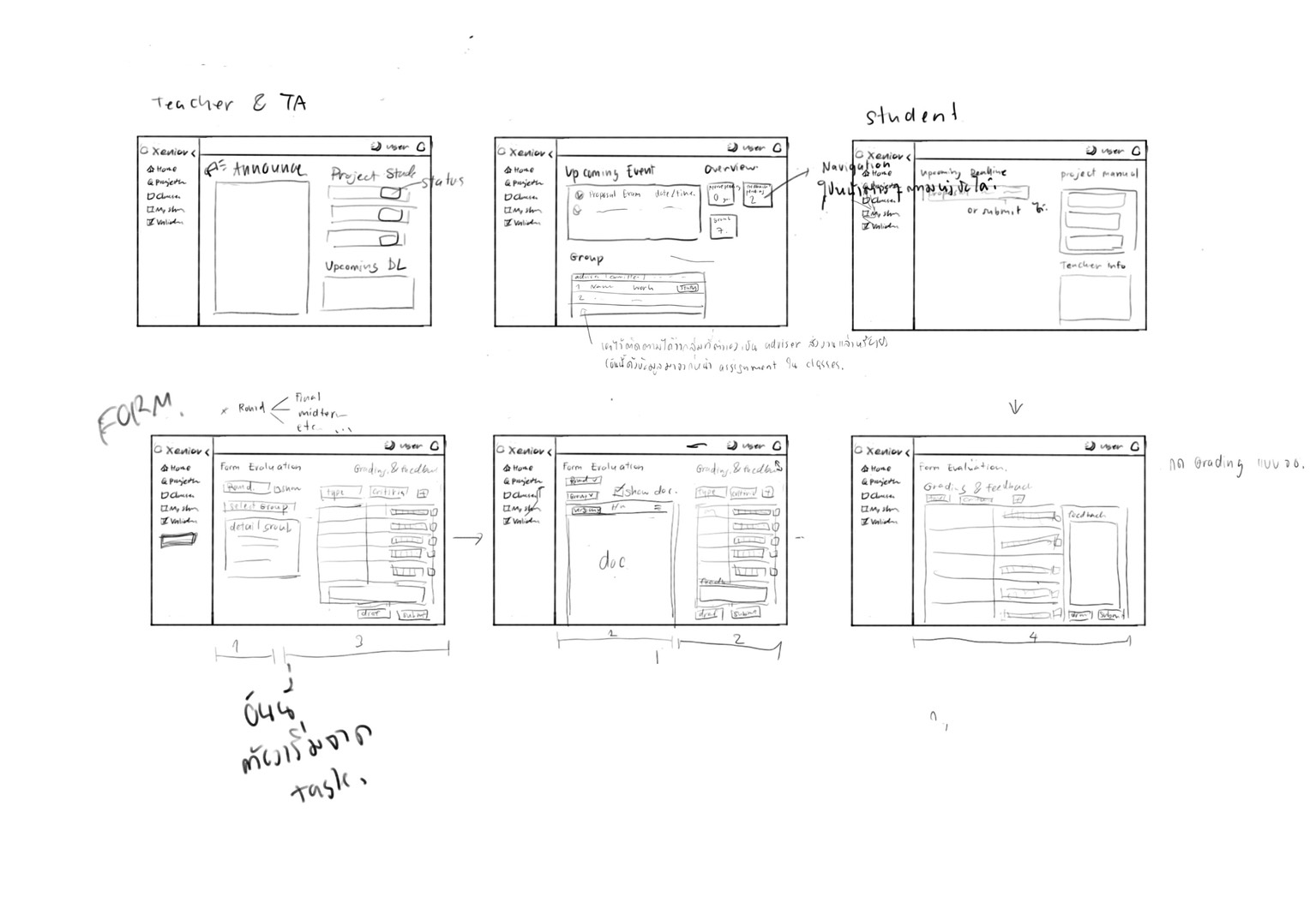
Low-fidelity wireframes (Procreate)
Rough layout and information hierarchy, prioritizing speed of iteration and shared understanding within the team before investing in detail.
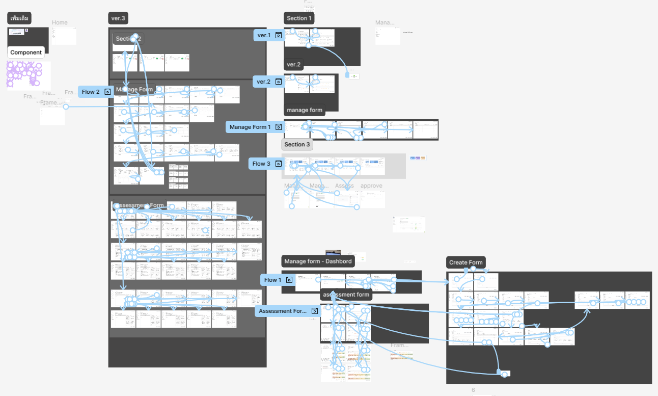
High-fidelity wireframes & interactive prototype (Figma)
Final color scheme, typography, and UI principles applied, then linked together into a clickable prototype that simulated real navigation and interaction before development began.
Feature
Key Feature: Xenior Interface
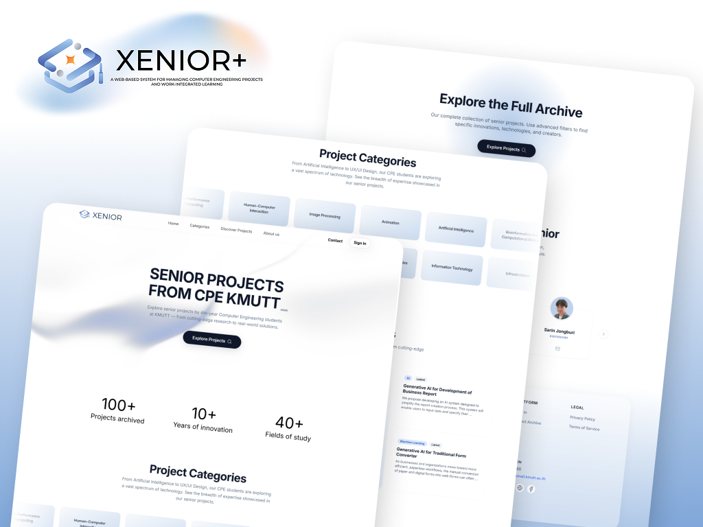
The interface redesign focused on making the system easier to navigate across different roles. Instead of giving every user the same generic dashboard, I structured the interface around the information and actions most relevant to each workflow.
- Role-based dashboards with different information priorities for Subject Owners, Advisors, Committee members, Students, and Admins
- Clearer navigation and information hierarchy to make key actions easier to find
- Upcoming Deadlines and progress information to help users see what needs attention at a glance
- A public landing page that introduces the system and guides users toward project discovery
.jpg)
.jpg)
Image 1 of 3
Feature
Key Feature: Xenior Form
Xenior Form digitizes the evaluation process end-to-end:
- Dynamic, rubric-based criteria that instructors can configure per assessment
- Group and member identification built into the form, so evaluators always know who they're scoring
- Report viewing side-by-side with the evaluation form — no more switching screens — with version history to compare current submissions against earlier drafts
- Inline comments per criterion, draft-saving, submission locking after deadlines, form duplication across subjects/years, and CSV import
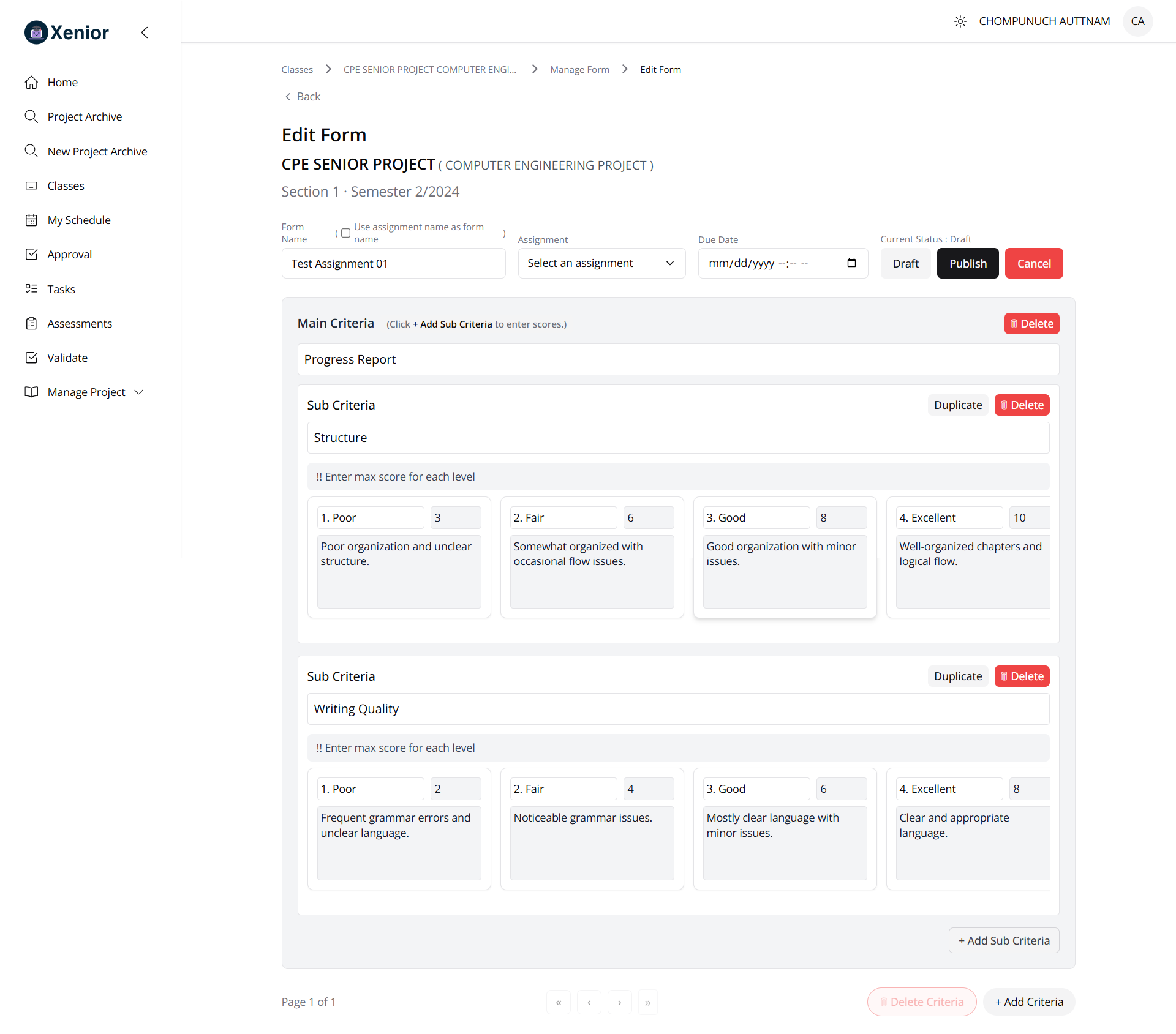
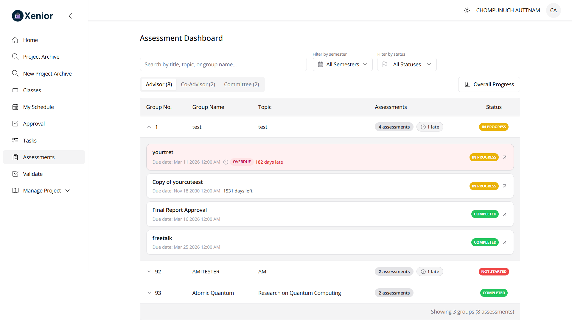
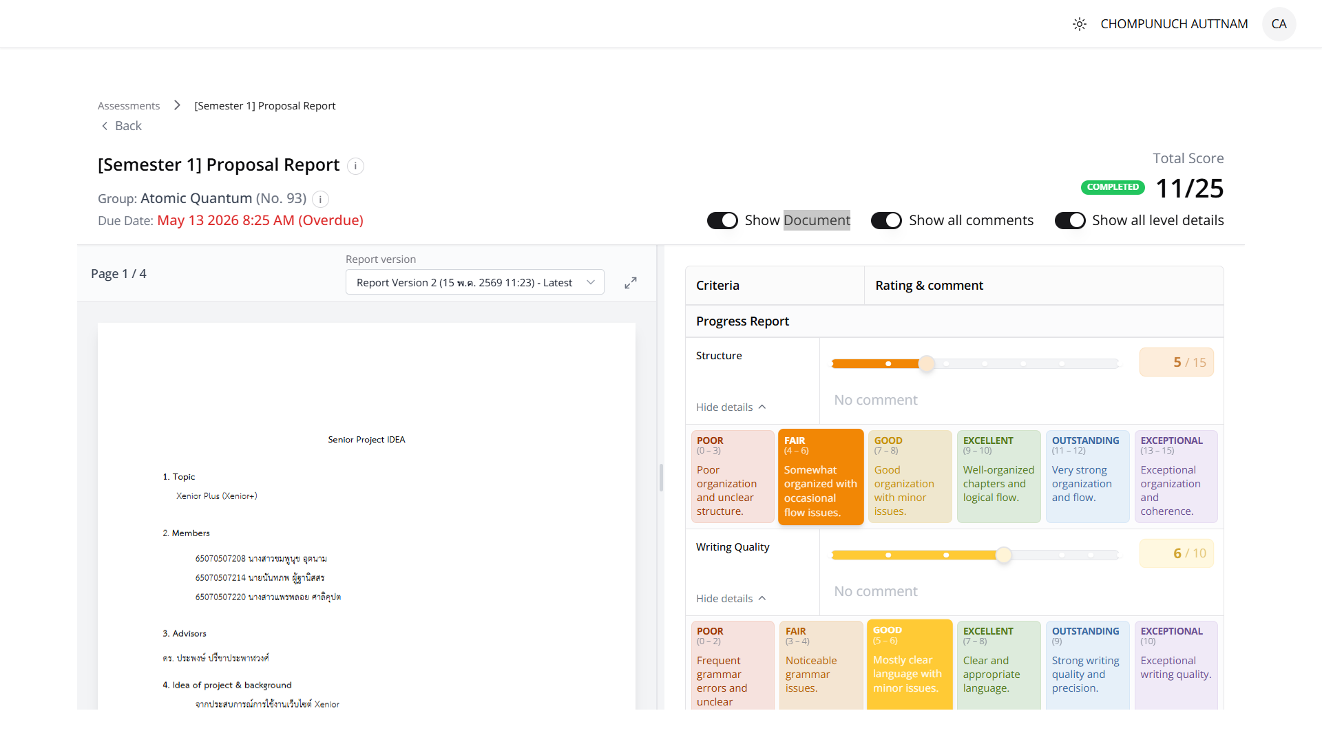
Image 1 of 3
Testing
Usability Testing & Iteration
What worked
- Instructors responded well to having evaluation centralized in one place, eliminating the download-file / listen-to-presentation / switch-to-Google-Sheets routine
- The scoring slider (supporting drag, direct numeric input, and decimals) was well received
- Search filtering and autocomplete were rated clearly better than the legacy search across all three user groups
- Students specifically valued the "Upcoming Deadlines" view for showing urgency at a glance
Issues identified and resolved within project scope
Terminology errors ("Criterion" vs "Criteria" used incorrectly)
FixedFeedback input field wasn't visually prominent enough, risking skipped steps
RepositionedEvaluation forms couldn't open in a new tab, making score comparison across groups hard
Added new-tab supportForm header took up too much space
Condensed, with detail moved to a popupNo way to resize the report/evaluation panes
Added resizable layoutLanding page lacked department contact info
AddedProjects without a cover image left blank space
Added category color-codingInstructor dashboard didn't clearly show outstanding vs. total workload
Added progress ratio + color coding
Deferred to future development
Semantic search (to handle queries that don't exactly match project titles), a carousel-style project showcase on the landing page, merging Announcements with the Senior Project Manual section, and deadline notifications.
Result
Outcome
Xenior+ shipped as a fully implemented, deployed system covering all three planned modules (Form, Search, Interface), validated through system verification testing and UAT with instructors, teaching assistants, and students. The evidence-based approach — benchmarking search performance, load-testing for capacity limits, and structuring UAT feedback into a tracked action table — meant the team could point to concrete, measured improvements rather than subjective claims, while also leaving a clear, prioritized roadmap for what comes next.